New Design
Since 2008, we have been developing custom WordPress themes (websites, blogs, newsrooms) for our clients through our company, sixty4media and I wear many hats (from customer service and accountant, to coder and developer). We love creating new, updated, and modern themes for our clients and about 12 months ago we figured it was about time that one of our biggest assets got an overhaul.
With little fanfare this weekend, we rolled out a new theme on Miss604.com. This is the second WordPress theme that the site has had throughout its five years on WordPress (in the early years before, it was powered by Blogger) and the last theme was implemented in 2008. At that time, I sat down with Hubert Florin from Raincity Studios and he created the Miss604 logo and the “girl” logo that I still use today.
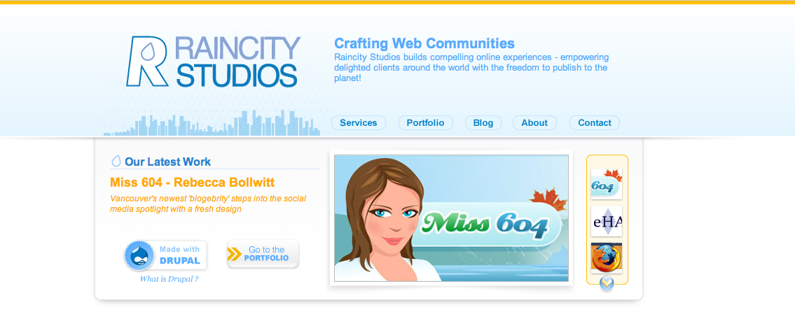
We wanted to maintain Miss604.com branding but upgrade my overgrown theme, bulked up from countless updates and changes over the last three years, so we did two things. We began a development site and we enlisted the design skills of our friend Preston from SixSix8 Productions. I’ve known Preston for over twenty years and we’ve worked with many of his designs before. He always works diligently to deliver exciting designs and is constantly honing his skills to produce the most up-to-date looks.

Over the last year we’ve done changes “when we can” between John’s day job and my work with our company. The design is a result of John’s knowledge, Preston’s creativity, and a whole lot of patience. The code is clean, I’m running a minimal amount of plugins, and from a developer standpoint, I’d like to think it looks rather slick behind the curtains.
I believe we achieved my goals with this theme, and there are still a few surprises and updates that will appear over the next few seasons. I do hope you enjoy the new layout and thank you for your continued readership.


9 Comments — Comments Are Closed
I’m really liking the illustration on the banner. Nicely done!
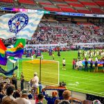
Looks very good: both readable and stylish. I like the touch of the new stadium (It’s probably the first online illustration to show it in this context).
You’re getting me inspired to start blogging again…
The only thing I’m not wild about is the font for the menu at the top and the ‘masthead headline’. Code says ‘Cufon Serif’ – that’s a font generator, isn’t’ it? I’m seeing something that looks a bit like Times New Roman, so I’m wondering if perhaps my browser is simply choosing ‘Serif’.
Thanks Phanyxx. Look for updates there during the year too.
Thanks David. Yeah it’s Cufon Serif, which doesn’t lend well to IE browsers so it’s using a general serif there. It’s also used on the featured slider and on sidebar headers.
I love the new design. The top bar is clear and stands out nicely, the line spacing in the main text is very comfortable to read, and the mix of blue and green colours at the top and bottom are easy on my eyes, as well as my Safari browser. 🙂 Great job and congratulations to all!
I like the addition of the new stadium on the banner and it’s obvious you’ve left space for additions in the design. Motivation to clean my site up as well..
I love the new design (especially the banner) but sadly, it takes longer to load on my old computer. 🙁
Love it!
Oh, you did write about the new design. I like it! The banner is good, could also look at doing a banner that spans the whole width.
The footer is nice too, makes it easier to see what I want when I scroll (I dont mind scrolling up/down).
Still a nice minimalist sorta design. Doesn’t seem cluttered.
The green bar at the top (with your social media icons) I think might want to be placed a few pixels lower as it breaks the drop shadow of the illustration.
Will you have a season based banner? I want to see snow-capped mountains! hehe
Who did the illustration? I want one like that too! haha
Looks very nice! A little more stuff, yet still continues to be very easy on the eyes!