Sears to Nordstrom: Official New Design
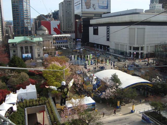
Earlier this year it was announced that Sears downtown was closing. Immediately rumours began to fly about what would occupy the space and if the bare white fortress-like walls of the structure at Pacific Centre would undergo a facelift.
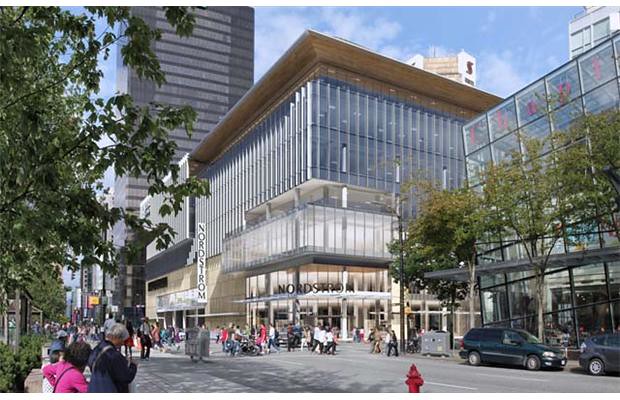
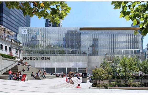
Drawings have been circulating on the internet for months, some believable and others not so much, stirring up a lot of public interest in this high profile location that borders Robson, Granville, and Howe. This morning Cadillac Fairview, the company that manages Pacific Centre, revealed the official plans the American department store Nordstrom which will move into the Sears building.
From the Vancouver Sun: “Nordstrom will occupy 230,000 square feet on three floors, including the street level. A new 48,000 sq.ft. multi-tenant retail space will be built on the lower mall level, while the top four levels of the building will be converted to 280,000 sq.ft. of AAA class office space.
From the Globe and Mail: “The department-store box will be broken up into two sections that give it the appearance of two buildings, according to several commercial brokers who attended the briefing Cadillac Fairview held last month. A glass entrance facing Georgia and Granville will be much more prominent and dramatic than the current one. And two deep light wells will penetrate the top four floors, adding even more light to what will become offices above the department store.”
Nordstrom will open in September of 2015 in Vancouver (at Pacific Centre), the fall of 2014 in Calgary (at Chinook Centre), in the spring of 2015 in Ottawa (Rideau Centre), and in the fall of 2016 in Toronto (at Sherway Gardens).







10 Comments — Comments Are Closed
I like however could be more of a showpiece since its the largest in Canada
This is going to make for great photography – the afternoon light will be fantastic in Robson Square!
It’s a heck of a lot better than what’s there now and it’s quite a lot better than the first renders I saw too, which I did not like.
hopefully there’s also a plan to fix the side that faces Granville
[…] Go here for images and the story. […]
My God! This is worse than the urinal.
Couldn’t they make a few breaks and set-backs to mitigate the scale?
And do something about that monotonous concrete, no street front, no public place, monstrous gray hulk of a thing next door . . .
The urinal and the gray concrete hulk have been the bane of the city for nearly five decades . . .
Roger, you are such a wonderfully predictable curmudgeon. How on earth is the proposed redesign ‘worse than the urinal?’ Barring any long-overdue improvements at the ground plane, which are neigh impossible to discern from these renderings, I still think that the proposed redesign is an immeasurable improvement over the aesthetics of the profoundly anti-urban, anti-street, mildewing Cesar Pelli design that has hulked on that site for 39 years.
Well, it’s much better than what is there now but I’d like to see something other than the regular downtown glass, glass and more glass. How about something with some character? Something a bit different and visual interest? I guess that comes though with Vancouver being a young city without much in the way of old world charm to draw on. But, again, it is an improvement than the huge white block that’s there now – which is sort of so ugly it’s almost cool. Odd.
Well Guest, a predictable curmudgeon eh!
Perhaps you do not remember the old Vancouver Hotel that occupied that site way back. Too bad! I was there and remember it well.
I was also there when César Pelli had the impertinence to tell us, “retail continuity on that block is inappropriate” referring to his urinal design (at the time he was employed by Victor Gruen, the huge US mall developer and, of course, had to tow the corporate line).
As for the old hotel, it had an all round chiaroscuro that reflected the shadows and moods of the day that gave that corner a humane touch something profoundly lacking in the thing proposed. Pity the current architect is oblivious to the history of the site.
Furthermore, it would be a mistake to compare the Pacific Centre black towers with the quasi Miesian TD Centre, Toronto. At least the latter has figure ground base, bleak as it is, that brings together the four towers.
That cannot be said of the Granville/Georgia/Robson cacophonous dystopia that should be Vancouver’s proud civic centre.
So far as the new Nordstrom thing is concerned, it is yet again a confusion of verticals and horizontals(form being horizontal, curtain wall being vertical). The base has no relation to the banal upper portion. The corner entrance spews out onto a busy, noisy corner.
All in all we have a potage of confusion in an area that should be Vancouver’s proud centre. Instead, it reflects a semiotic of what Vancouver really is.
I leave you Guest to decipher what that is! I hope the architect gets paid.
Instead of talking about the architecture we should all be appalled that an expensive American chain has to move into the heart of a great Canadian city.