Vancouver 2010 Olympic Torch and Symbols
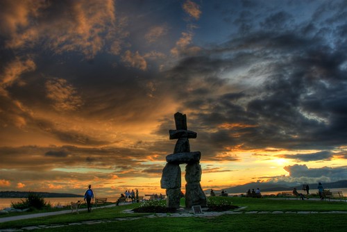
A few years ago when I worked at a newswire service I went into the office on-call to help VANOC with their official logo announcement. While watching the ceremonies on TV with the VANOC contact on the telephone, the moment the curtain dropped to reveal Ilanaaq (the Inukshuk) I sent the image over the wires.
The response to the logo is still pretty mixed as some question how relevant it is to the City of Vancouver, might think the cartoon smile is a bit too cheesy, or others think it’s the perfect symbol of harmony and history of local cultures.
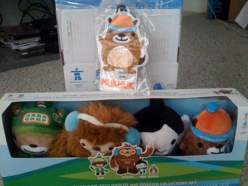
When the mascots were unveiled for Vancouver’s 2010 Winter Olympic Games the mash-up characters (Quatchi, Miga, Sumi) were actually pretty accepted and I believe the hockey-playing Quatchi dolls are still flying off shelves at The Bay. However, I was personally disappointed that the Vancouver Island marmot, Muk Muk was only a pseudo mascot until recent months.
Reactions to almost every aspect of the Games have not come without criticism across the nation and the latest symbol and marketing push came yesterday with the presentation of our 2010 torch that will travel 45,000 kms with 12,000 Canadians to carry it from coast to coast.
On the radio they were calling it “driftwood” or “a miniature ski” but whatever the reaction this symbol, designed by Bombardier, will get much exposure as it carries the flame from Greece to BC Place.
Also, since the Games are coming to the Lower Mainland and Canadian athletes will be training and competing for our nation, right here in all of our back yards, let’s just hope they come up with some better designs for our team outfits than the “camouflage” worn in Beijing.
[poll id=”27″]










9 Comments — Comments Are Closed
That torch design is pure awesomeness! Bombardier have outdone themselves. Are they gunning for PorscheDesign?
Man, so much of the design around Olympics stuff feels like it was by a huge, multi-tiered, org-chart-crippled committee. I also think the iconic stuff-the torch, the mascots, the logo–have been done to death over the years, so they’re incredibly hard to get right. The designs always end up feeling like compromises, and have, metaphorically speaking, all the corners rounded off.
The torch, to me, looks like a dental hygiene tool or a sex-toy prop from the movie “AI”.
I’m looking forward for the Olympics but at the same time I just can’t wait until it’s over and done with.
Personally think we could have gone without the clock(s) How many times did someone have to clean it and the money that could be spent elsewhere instead of having someone stand guard over that clock.
2+ weeks of not being able to train on the creek is kind of a blessing but at the same time not so much (when I’m trying to train for worlds)
@ Kimm I forgot about the clock!
The clock.. umm yes interesting.
The torch that doesn’t look like a torch.
Doesn’t the Inuckshuk represent a hunting ground or storage place for meat for the Inuit?
And I don’t agree how the mascots have an Anime flair to them.
That being said.. yes I do have tickets to see an Olympic event up at Whistler. Sure I spent $360 on 2 tickets though it’s only an hour long event.
Though living in the West End I wonder how it will affect daily life around our neighbourhood. Road closures starting 2 week prior to the Olympics to get people to ‘use transit’ or something? ahh well 🙂
Guess I’ll just try to embrace it 😉
i love the clock!
[…] to a poll I conducted last February, my readers chose the mascots as their favourite symbol of the Vancouver 2010 Games. With all of this travel, public relations, and hanging out with the […]
i love mukmuk
i like quatchi!!!