
New Canucks Uniforms
Scroll down to view all the rumoured jerseys and the OFFICIAL new jersey launched today, August 29, 2007 (view my Flickr photos tagged: newcanucksuniforms.
Feb 24, 2007: The Vancouver Canucks logo has been the topic of much debate recently. This is evident when I’m browsing my stats and see that “Johnny Canuck Logo” is the term most searched, that will link to my blog.
We read tonight on J.J.’s site (who is a fellow Crazy Canuck, btw) that there will be new Canucks jerseys come this August.
After Francesco Acquilini bought out John McCaw, there had been numerous speculation about the future of the whale jersey. The Canucks were scheduled to wear their vintage stick jerseys for 25 of 41 home games this season; do they wear it full-time next season? Or will they unveil a completely new jersey with a new logo on August 1st? [Canucks Hockey Blog]
He is referring to an article in today’s Vancouver Sun suggesting that we’re due for a logo change – for real.
After receiving a tip via our lovely yet handy Crazy Canucks feedback hotline, we found what appears to be some photos of the mysterious “new” Canucks jersey via CyberBuzz’s site.

Could this be the new jersey or is it as fictitious as some of Zanstorm‘s (hilarious) photoshop creations [1] [2]?
Update: Another fellow Crazy Canuck, Alanah, has debunked this mythical jersey over on her blog, Canucks and Beyond. It’s a fake, folks.
Update: July 26, 2007 – John has another scoop on a possible new logo [Audihertz.net]. Source is JJ who had a reader send him the following on the Canucks Hockey Blog

August 2, 2007 – The following is from Sportsnet via CanucksAndBeyond:
The Canucks are holding a ‘closed door’ photo shoot Thursday afternoon , where the subject will be the new-look jerseys in line for the 2007/08 season. The local Canucks’ message boards are ablaze with speculation, with most believing the team will go back to the retro blue and green colour scheme. However, what the logo will look like remains a mystery.
EDIT: … this press conference was postponed.
Update: August 16, 2007 – Chris just sent me a link to these forums where this is the rumoured new look.

Update: August 22, 2007 – I’m loving this “hybrid proposal” as featured on Canucks and Beyond.
Update: August 27, 2007 – Alanah has some really great “rough sketches” that were submitted to her via email, rumoured to actually be the new logo. Seriously… does anyone think this is actually the front runner so far?

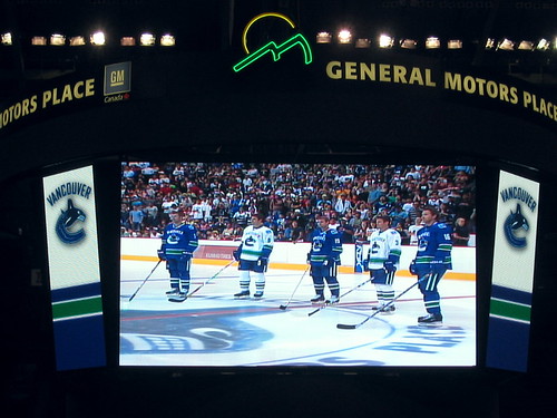
August 29, 2007 – I was at GM Place today for the unveiling. The new uniforms are blue, green and white (exact vintage colour scheme) with the orca logo in blue and white AND the word “VANCOUVER” written across the top. Photos are all available on my Flickr under tag: newcanucksuniforms.


46 Comments — Comments Are Closed
[…] This could be complete junk, but it’s worth passing on. An email came in to The Crazy Canucks about what showed up into this guy’s email. Based on this post by J.J. earlier today, I can’t say that I’m too surprised, and it fits with what I said about the new NHL uniforms coming about next season[post]. Still, are Canucks fans ready for the return of the stink-in-rink and Johnny Canuck? […]
personally i like the orca jerseys, they are one of the sharpest looking jerseys in the NHL (imho). i think it’s great that they use the original jerseys as a tip of the hat to the old days. maybe they could go back to the horrible ‘v’ jerseys of the 80s, haha.
are you kidding me the orca jerseys are the lamest in the NHL. Get rid of that garbage already. We’re the canucks not the vancouver orcas or vancouver natives.
Don Taylor from Sportsnet claims this is the way the Canucks could be going so there is some weight to this. As far as our past jerseys the best one weve had is the the original Blue and green rink with the stick. I think the represent the province well, blue for the ocean and green for the all the pot.
I would prefer to see the original jersey come back full time. The current Orca is nothing more than a reference to Orca Bay, no matter what they claimed.
I’m trying to think of a team that has gone through more complete redesigns of their logo and uniform than the Canucks. Maybe the Kings, or Buffalo.
I’m finally use to the orca, atleast it’s west coast. Personally I liked the skate jersey’s the best, but I love the current colors. And logo changes don’t always turn out well. It took me a good 2 seasons before I started liking the orca, I don’t want to have to get use to some other thing. The old logo would be okay I suppose. I’m very tempted to make a sign for when I go to a game in April that reads “Leave our logo alone” lol. But that’s just my opinion.
GET RID OF THE ORCA!!!!
We are using a corporate Logo for our franchise that reflects the (former) company that owned the club, not the club its self.
Also, its too buisey. How many colours do we need in our jersey? Maroon, Blue, Black, White, Silver…? Gimme a break. The designers forgot that things dont need to be comlicated to be effective. Go back to the basics. For example, look at the original 6 jerseys, all very simple, and very sharp. Thats what we need.
They should just Stick (pun intended) to the “Stick” logo. Its very basic, it out sells every other jersey they have released in this “Orca” era, and brings alot of Pride and Tradition along with it.
…just my 2 cents.
Finally, someone has some sense to figure out that a Canuck is not a whale, an upside down skate or a hockey stick but a northen woodsman –for all you people who don’t know the Canucks were not invented by the NHL–they were a team for many years before in the WHL(not junior) but pro that was almost as good as the NHL only it was all in the west—Seattle, Portland, LA, San Francisco, Edmonton, Calgary, Victoria , Denver etc. as travel costs etc. were high and many players made more money staying here , for example Guyle Fielder who was from saskatchewen made mor money playing for Seattle than he did for Boston and stayed in seattle a result. The Johnny Canuck is the real tradition not the hockey stick patch that we all detested in the 70’s when it was brought in with the expansion Canucks. It has hurt true Canuck fans for years and years of bad uniforms when finally somebody has got it right and will once again put the correct logo on a Canucks uniform that will be real and something to relate to properly.
[…] Our blog posts about the jersey rumor: J.J., Alanah, Rebecca, John […]
[…] * Alanah on Kukla’s Korner: Ducks and Kings Heading to London * Buzz Bishop’s Website – New Canucks Uniforms * Our blog posts about the jersey rumor: J.J., Alanah, Rebecca, John […]
I would love to see the Canucks go back to the Johnny Canuck logo. As a Blackhawk fan,who hails from Vancouver I am proud to wear the best uniform]logo in pro sports! I disowned the Canucks when they wore their clown outfits of the 80s. Apparently the Canucks paid some idiot $$$$$$ for that design!!!The Johnny Canuck Logo is simple and classy.It just needs some brighter/warmer colors added to the uniform to attract the eye.(red, gold, or silver) Nick.
love em!
i think they should keep these new jerseys and use the orca as their vintage ones
When I close my eyes and think about the Canucks, I see the late 80’s-early 90’s White jersey with the red, orange and yellow skate. They looked sharp, had nice bright colors and when you think of the 1994 Play-offs…………what were they wearing?!?!?!?!
BRING BACK THE SKATE!!!!!!
I love the skate – totally takes me back to the days when I was growing up with the Nucks
what the hell are those they look gay i boaght the old jersey for a 100 $ these are ugly.
I Think The new logos look pretty cool, I never liked the orca jerseys, but I think the vintage 70’s hockey stick logo is the best. If I had a choice I’d go back to that.
The Blue Green and White is excellent for the future colours of the team. Looks great on TV and also it is a colour scheme that no other NHL team is using presently. It is the Canuck colours that I grew up with as well. I don’t really like all of the over done striping on the jerseys though. I prefer the simpler look of striping around the waist of both jerseys and simple striping around the sleeves as well. The Canucks have been in the NHL since 1970. That’s 37 years. We should start acting like a team that is classic rather than trying to create a new jersey every seven or eight years to “try to sell hockey in our non hockey market” like some of the southern most teams that are not selling the game very successfully at this time. I’ll add that The Johnny Canuck logo looks very cool as well on the blue jersey. It’s a classic logo!
I have heard that white will be the colour of the home team next year, in the NHL, so the classic hockey stick and rink logo is a good choice for the white jersey if this is the case. Roberto Luongo’s mask, for the vintage jersey games this season, has a Reebok logo on it and a hockey stick and rink logo as well as the Johnny Canuck logo on it. I think the mask has been done up this way to match these rumoured 2007-08 Canucks jerseys. (Why else would the reebok logo be on the mask with these two logos? ) Roberto is thinking ahead with this mask design. Also his blue and green pads from this season will be well worked in as his season starting pair for next season.
I believe these drawings to be the Canucks jersey for 2007-08. The Canucks are denying it because they have much merchandise left to sell with the whale logo on it. August 1st will be a cool day for Canuck fans and also the day that whale logo merchandise is sold for a huge discount! (Collectible for nostalgia buffs of the future.) I love the Canucks and cannot think of anything more entertaining, in the dead of winter, than going to a Canucks game. (Ice pack holder for the second season running.) Keep on working boys and the Cup can be within reach some day soon!
This jerseys are ugly as hell we should keep the orca and the vintage the same and jhonny canuck should leave the canucks jerseys alone
leave the logo man when the nhl tries to make logos the suk example recents changes like buffalo and anahiem
I drew that Johnny Canuck logo and posted it on chriscreamer.com. Everyone over there knows who made the logo. Some kid then stole it and pasted it on a photoshopped all star jersey. It’s not the real Mcoy, trust me.
Here is another design!
http://photos-464.ak.facebook.com/ip002/v64/100/27/502408789/n502408789_36464_1001.jpg
These are not in any capacity official jerseys. I know because my brother made them. You can see a variety of his designs on the official Canuck forum under the handle, EnglandWins. The designs did get him Canucks tickets from Don Taylor at Team 1040. These above designs were merely a stab at what could be the next Canucks kit.
The feedback from the Canucks was that Reebok and the NHL are responsible for design work for team sweaters and anything else would not be legal. They will be premiering their new kit supposedly in August. They did say that the original colours(blue, green) would be a part of the design.
My personal opinion would be that they will use the rink/stick logo but in an offset newer design.
It was confirmed to me, at G.M. Place, that the Canucks jerseys for 2007-08 will be in green blue and white. The staffers, there, would not divulge the logo though. Also they were firm to point out that these other reebok renderings are not the new jersey.
G.M. Dave Nonis has repeatedly said the whale logo will be the team’s logo this season. So maybe the whale logo is going to be done up in blue green and white and maybe the hockey stick and rink logo will be featured on the shoulders of these new jerseys. This would blend the whale logo and the vintage logo into the new 2007-08 jerseys of the Canucks.
The Reebok design will probably give reason for some way out stripings on the jerseys and the font used for the numbers could be over the top as well. However, as seen with the new Bruins jerseys the classic look can be found with these new Reebok Edge jerseys as well. My hope is that the Canucks go down this “classic look” road and feature the hockey stick and rink jersey front and centre on the new jerseys for 2007-08. (Maybe the blue green and white whale logo idea could be implemented onto the shoulders of such a new jersey.) But I have been guaranteed that the colours for the Canucks will be blue green and white and that no team will have a third jersey in 2007-08
The Boston Bruins official web site (via nhl.com) says the black jersey is home and the white jersey is away. So the Canucks will be wearing white on the road this season and blue at home.
canucks can’t score so who cares
i think that we will find it tough season because we won’t be able to score the lucky goals like last year and players will solve luongo we really need some gola scores anyone at this point cause sedins can’t handle top checking lines and nazzy just hasn’t been the same.
the main thing i’m scared about is looking like the maple leafs if we’re in blue and white jerseys 😛
Yeah, yeah, the Nux suck as far as entertainment value under Vigneault but jersey-wise it HAS to be Johnny Canuck. There is no other choice. The stick in rink logo sucked back when it first appeared and although now being retro it sort of has some appeal, it looks like it was drawn by a 2 y/o. Also, when I was a kid it took me forever to figure out it’s supposed to be a “C”…always thought it was some dopey rink with a stick in it.
You can tell the new color of the team, simply by visiting their website. Last summer during the playoffs, they posted those ‘Believe’ wallpaper images, which were in a different color blue than had been previously used…also, it used the all white whale logo. That was a foretelling of what was to come. The website changed its color scheme after the season ended, giving it more of the blue tone from the ‘stick and rink’ or ‘Johnny Canuck’ logos…not the midnight navy from the old whale.
Bottom line…the Canuck PR group should get an award for the buzz they have created around this. Good or bad…its got people talking about the Canucks ALL summer long. Nice work.
[…] friends have the scoop but nobody knows why this store was selling them…of course this hat could just be a […]
[…] been keeping a post active since February regarding speculation about the new Canucks logo. You can head there to view the […]
[…] have an ongoing post about the new Canucks uniforms (as previously mentioned… a lot) but I’m also hoping to cover the unveiling of the […]
[…] If you live or work around False Creek this morning you may find a few more people milling about than usual. Over at GM Place we’re going to attend the official logo launch tailgate party on the South Plaza at 11:30, then head in to the arena for the unveiling at 12:30pm. I’ll have an update posting to my ongoing Canucks Uniform post. […]
Live stream at http://canucks.nhl.com/team/app/?service=page&page=NHLPage&id=17540 http://nhl.edgeboss.net/wmedia-live/nhl/22829/500_nhl-canucks_070727.asx
The suspense is killing me!
Me thinks the ‘VANCOUVER’ above the whale is there to help all those Americans that cannot spot Canada on the map.
Trivia: What country is located south of Detroit?
GZ: I don’t know… I don’t own a map 😉
Re: the new jersey… I love my t-shirt but as for the entire uniform? I think it’s a little busy. I love the vintage colours, I don’t mind the whale, I even like the “Vancouver” as sort of a throwback to the Millionaires, but all put together, yeah a little cluttered.
The sweaters should have been one or the other. I really like the retro ‘Vancouver’ look…but it needs to be on its own. A better option would have been to have a home jersey with the ‘Vancouver’ and the road jersey with the whale.
M’eh! Could be worse…could be the buff-a-slug.
I wholeheartedly agree with both of you. There’s too much happening on the front. And yes, it’s far better than the Buff-a-slug (which is a new term to me, I simply referred to them as the raging snails).
[…] pictures from the event in my photo section. Rebecca and John already have more in depth coverage on their […]
Blue green and white looks very Vancouver. And the classic strpings of the new jerseys are terrific as well. I even like the cartoony version of the hockey stick and rink logo found on the shoulders.
I’m not too crazy about the “Vancouver” letters on the front of the jerseys. Although I think the new jerseys will look better, to most fans, with time. I think if these letters are a must, I would have them read “Vancouver” on the away white jersey, and “Canucks” on the home blue jersey. (Like baseball teams who word the team nickname on the home jerseys and the city name on the away jerseys. (It’s a polite gesture to the fans of the teams played while on the road to show the city name but at home we all know it’s Vancouver. So the nickname is all the home town fans need to see if any at all.
The number font is a bit tight or fine lined on these new jerseys. I think I would like to see the numbers a bit fatter on the jerseys and styled like the vintage jersey numbers. (The number font used looks like the font used on recent Team Canada jerseys.)
Conclusion. These jerseys are ok and any Canucks fan will grow to like them in time. However I would have used the hockey stick and rink logo as the primary mark and if the whale logo must remain then it should be the secondary mark found on the shoulders of the jersey. (I think Johnny Canuck would have been a terrific shoulder patch to compliment the hockey stick and rink logo. At the end of the day it’s about winning the Cup and seeing Trevor Linden wind down a terrific career in style would look great in any Canucks jersey. Same with Markus, Mo and Mattius. Willie , Roberto and Kevin can assume the roles of team leaders in the future too.
Blue green and white looks very Vancouver. And the classic stripings of the new jerseys are terrific as well. I even like the cartoony version of the hockey stick and rink logo found on the shoulders.
I’m not too crazy about the “Vancouver” letters on the front of the jerseys. Although I think the new jerseys will look better, to most fans, with time. I think if these letters are a must, I would have them read “Vancouver” on the away white jersey, and “Canucks” on the home blue jersey. (Like baseball teams who word the team nickname on the home jerseys and the city name on the away jerseys. (It’s a polite gesture to the fans of the teams played while on the road to show the city name but at home we all know it’s Vancouver. So the nickname is all the home town fans need to see if any at all.
The number font is a bit tight or fine lined on these new jerseys. I think I would like to see the numbers a bit fatter on the jerseys and styled like the vintage jersey numbers. (The number font used looks like the font used on recent Team Canada jerseys.)
Conclusion. These jerseys are ok and any Canucks fan will grow to like them in time. However I would have used the hockey stick and rink logo as the primary mark and if the whale logo must remain then it should be the secondary mark found on the shoulders of the jersey. (I think Johnny Canuck would have been a terrific shoulder patch to compliment the hockey stick and rink logo. At the end of the day it’s about winning the Cup and seeing Trevor Linden wind down a terrific career in style would look great in any Canucks jersey. Same with Markus, Mo and Mattius. Willie , Roberto and Kevin can assume the roles of team leaders in the future too.
They should have gone back to the FLYING SKATE as the logo. and why is it not on the shoulder somewhere, how can they ignore over 29 years of there history?? I left when that logo left, and everytime they try to improve there look, they fail. GO FLAMES
[…] popular post: New Canucks Uniforms – February to […]
[…] Before I start saying that this is an officially “leaked” photo, may I remind everyone of last year’s logo mayhem. […]
lets go back to the original Johnny Canuck, exactly as it was….loose that dam Orca thing
[…] George’s only opposition to the team lies with their jersey choice — and I believe a strong representation of Vancouverites may be with him on that one. Photo credit: John Bollwitt on […]